


02 / Website development
Genia Laid That
A custom-built website delivering a polished online presence and clear brand identity for the business.
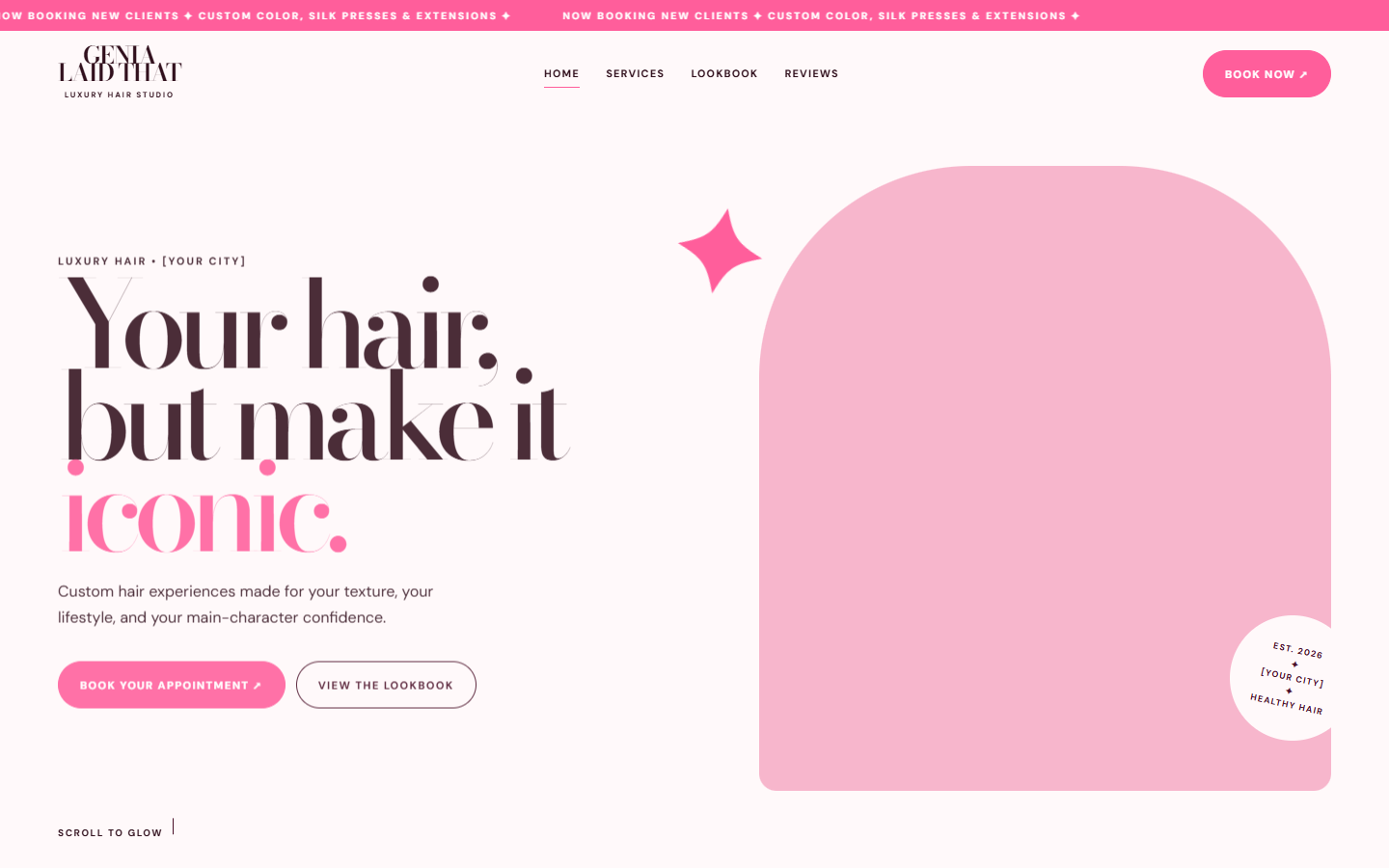
A stylist brand with a strong personality, coded into a site that carries that personality without slowing the page down.
These projects demonstrate Golden Door's hands-on development work. The coding was completed in full; the original visual designs were provided separately.
The visual direction for this project was supplied, and Golden Door delivered the development. That meant building the whole front end by hand—structure, styling, interaction, and deployment—so the finished site matched the intended look while remaining fast, accessible, and simple to maintain.
What was built
From supplied designto working site.
The site was written from scratch rather than assembled from a template, which is what made the brand's type and spacing decisions possible to hold onto.
- StructureA hand-coded front end with semantic sections, a shared navigation pattern, and consistent spacing tokens.
- IdentityBrand type and color implemented as reusable CSS variables so headings, buttons, and accents stay consistent across pages.
- BookingAppointment and contact routes surfaced in the header, in-page calls to action, and the footer.
- MediaPortfolio imagery prepared at appropriate sizes with lazy loading, so scroll-heavy galleries stay smooth on cellular connections.
- LaunchDeployment, cross-browser testing, and handoff once the pages were verified on real phones.
Implementation notes
The details thattook the time.
Bold branding is easy to draw and easy to break in code. Most of the effort went into making the loud parts behave.
Type that holds up
Oversized headings were given per-breakpoint sizing and line control so they stay dramatic without overflowing or splitting mid-word.
Motion as punctuation
Entrance and hover animations were kept short and purposeful, with reduced-motion preferences respected rather than ignored.
Booking flow clarity
The path from landing to appointment request was shortened, with the action repeated at each natural stopping point on the page.
Maintainable CSS
Shared variables and a small, readable stylesheet mean future changes are edits, not rewrites.
Responsive behavior
Most visitors arriveon a phone.
The brand lives on phones, so the phone layout was treated as the primary design rather than a fallback. Wider screens got more room, not more decoration.
- PhoneStacked sections, generous tap targets, and headings sized to the viewport instead of scaled down from desktop.
- TabletGrid arrangements introduced where the extra width genuinely helps scanning.
- DesktopFull-width imagery paired with contained text columns so nothing runs to uncomfortable line lengths.
Good branding deserves markup that does not fight it.
The coding was completed in full, from the first section to deployment, and the design direction it implements was provided separately. The lasting value of the project was proving how far careful hand-written HTML and CSS can go for a small business—fast, editable, and fully owned by the client, with no platform subscription attached.