


01 / Website development
Captivating Stylezz
A fully coded website implementation built to give the business an online home and a clearer digital presence.
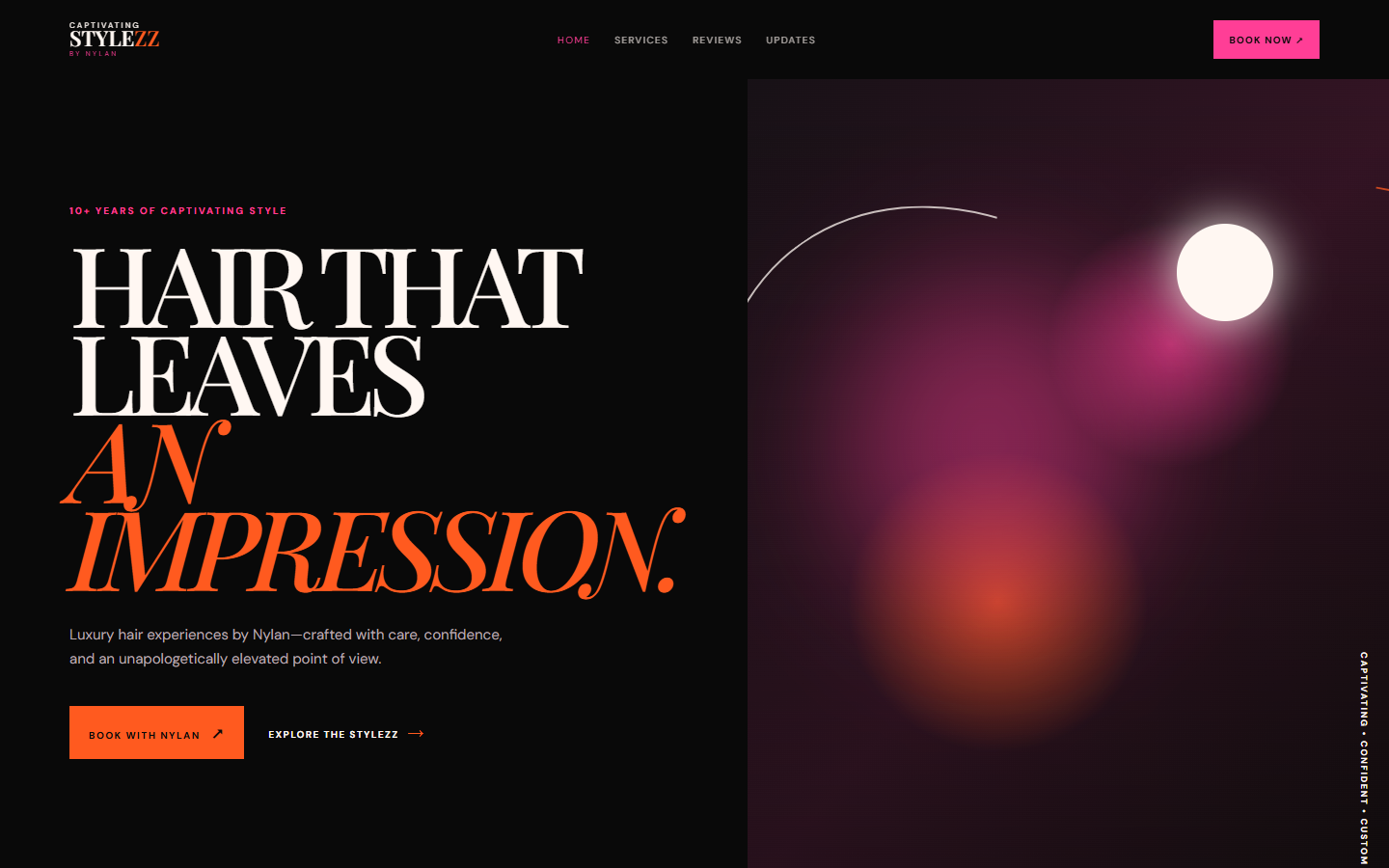
A luxury hair studio with no real online home, turned into a coded site that presents the brand and points visitors straight at booking.
These projects demonstrate Golden Door's hands-on development work. The coding was completed in full; the original visual designs were provided separately.
The studio had a visual direction prepared for it and needed that direction turned into a working, hand-coded website. My job was the build: translating the supplied layouts into semantic HTML, CSS, and JavaScript, wiring up navigation and booking links, and making sure the result held together on real devices rather than only in a design file.
What was built
From supplied designto working site.
No page builder and no theme. Every section was written as markup and styled to match the layouts that were handed over.
- PagesHome, services, gallery, and contact sections built as hand-coded templates with a shared header, footer, and type system.
- TypeBold editorial headings implemented with a web-font loading strategy that avoids layout shift as the display face arrives.
- BookingBooking and contact paths wired throughout the page so the next step is always one tap away from wherever a visitor stops.
- GalleryImage presentation with sized, compressed assets and lazy loading, so photo-heavy sections do not stall the first paint.
- HandoffDeployment and handoff to the studio's own hosting, with the source structured plainly enough to edit later.
Implementation notes
The details thattook the time.
Implementing someone else's design well means the small decisions that were never drawn: how motion behaves, how type reflows, what happens at the awkward widths in between.
Motion with restraint
Section reveals and hover states were added with CSS transitions and IntersectionObserver, tuned so the studio's photography leads and the animation stays out of its way.
Editorial type in code
Large display headings needed manual line control at each breakpoint to avoid awkward single-word lines and mid-word breaks.
Image weight
Photography is the product here, so every asset was resized and compressed and given explicit dimensions to keep the layout stable while loading.
Clear next step
Booking and contact affordances were kept visible as the page scrolls, because a salon site that hides the booking link is not doing its job.
Responsive behavior
Most visitors arriveon a phone.
Salon traffic is overwhelmingly mobile, and that assumption drove the build order. Layouts were assembled mobile-first, then opened up for tablet and desktop, rather than compressed down from a wide design.
- PhoneSingle-column stacking, full-width imagery, and tap targets sized for thumbs.
- TabletTwo-column service and gallery arrangements once the width allows it.
- DesktopThe full editorial layout, with headings held to comfortable line lengths instead of stretching across the viewport.
Implementation is where a design either survives contact with the browser or quietly falls apart.
The build was completed in full and handed over running. What I would take forward from it is how much of the work sat in the in-between states—the widths, the loading moments, and the interactions that a static design cannot specify. The visual direction came from someone else; making it behave correctly everywhere was the development contribution.